Data Storytelling 10: Form Follows Function
Affordances & Accessibility. Next post will cover Aesthetics & Acceptance
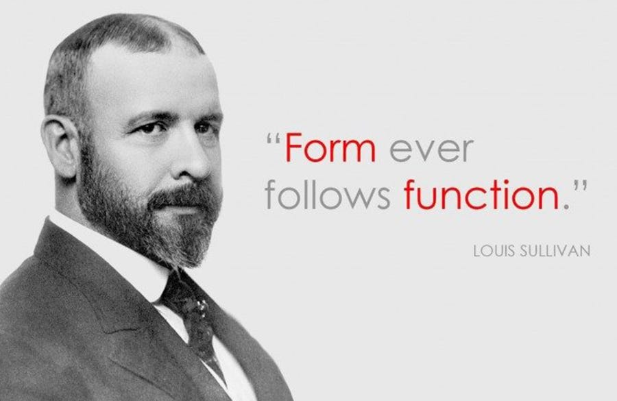
“Form Follows Function”. This is a design principle, although meant for those that work in construction, it can still be applied to our data reports. The original quote means “the purpose of a building should be the starting point for its design”
For us, we want to think about what it is that we want our audience to do, when presented with the data (function). Once we know where we want to take them, then we can create an appropriate visual (form), that will allow this to happen with ease. In our case, we are going to be focusing on 4 main key components:
Affordances
Accessibility
Aesthetics
Acceptance
We’ll discuss affordances & accessibility on this post.
1 - Affordances
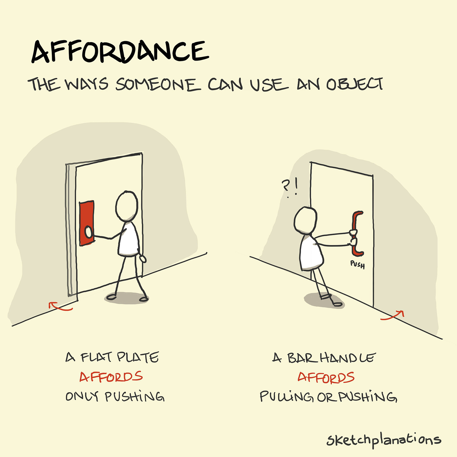
In the field of design, the experts talk about objects having “affordances”. Affordances mean there are unique aspects to the design of an object that make it obvious on how the product is meant to be used. In order to apply affordances to our reports, we will have to focus on 2 key things:
highlight the important stuff
eliminate distractions
1.1 Highlight the important stuff
We’ve already talked about using preattentive attributes to grab your audience’s attention, and then channel it somewhere you want it to go. In this specific case, the key here is to only highlight a fraction of the overall visual (the important stuff). The reason for doing that is because highlighting effects are diluted, as the percentage of objects that are highlighted increases.
Here is a simple list of highlights you can use:
Bold, italics, underlines: for tables, labels, captions, and small sentences
CASE, and typeface: UPPERCASE words in small sentences are easily scanned, great for titles, labels, and keywords
Color: great technique for highlighting, but have you use it minimalistic ally
Size: it does matter, and signals importance
1.2 Eliminate distractions
While you highlight the important parts you want your audience to pay attention to. You should also go ahead, and remove all potential distractions. Here is a simple checklist you can look at in order to help you identify potential distractions:
Get rid of non critical data/components
When detail isn’t important, summarize it
Ask yourself: If you got rid of this element, would it change anything?
Push all non impacting items to the background (aka make most elements light grey colored to push them to the back)
2 - Accessibility
This concept says that designs should be usable by people of many diverse abilities. In other words, it should be accessible to as many people as possible. Applied to our data space, this means that your report should be accessible to many different people with many different backgrounds.
At your heart, you might be an engineer, and may want to talk about p-values on your report. But, the shareholder who owns the company probably has no idea wtf a p-value even is. So, it’s your job to make your visuals, and your presentation as accessible as possible. Here’s 2 things to keep in mind when you do this:
Don’t overcomplicate
Text is your friend
2.1 Don’t overcomplicate
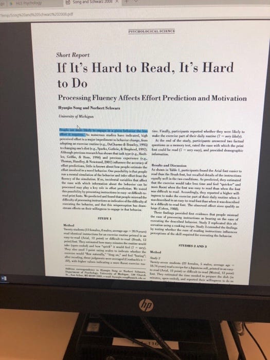
“If it’s hard to read, it’s hard to do”. There was an experiment done at the University of Michigan. They had 2 groups of students with instructions. The first group had clear instructions, and the 2nd group had the exact same instructions but written in complex sentences.
The students were then asked how hard will it be to do the tasks. Obviously, since the task for the 2 groups of students is the same, the text should’ve made no difference. Instead, what they found out was that those who got the crappy text actually thought the task would be super difficult & extremely time consuming. This is what the quote “If it’s hard to read, it’s hard to do” means.
Here are a few things to keep in mind when working on your presentations:
Make it legible: use a consistent, easy to read font
Keep it clean: make your visuals approachable
Use straightforward basic language: swap some of GPT4’s words with basic english words
Remove un-necessary complexity
2.2 Text is your friend
Good use of text helps make sure your data viz is accessible. There are a few types of text that must always be present. Examples include:
Titles for your graphs
Labels for both axis
Labels for your data series
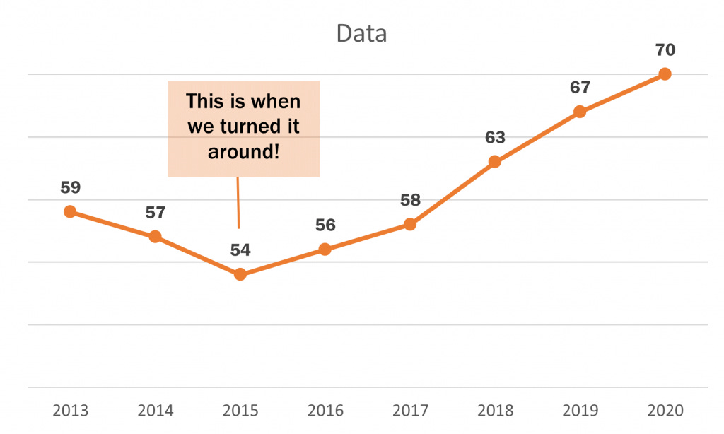
Annotations that describe certain events (if analyzing time series)
Also, don’t assume that two different people looking at the same data visual will come to the same conclusion. If you have a conclusion that you want your audience to reach, then you need to state that conclusion in words. Don’t forget to use pre-attentive attributes to help push your audience to that conclusion too.


