Data Storytelling 12: Analyzing *Great* Graphs
3 different graphs, and complete step by step breakdown on why they work well.
At this point, you’ve gotten all of the theory out of the way, let’s take a look at what good visuals look like, and let’s breakdown why they are good.
1 - Line Graph example 1
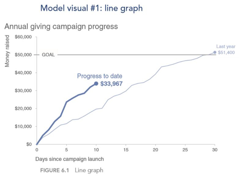
Let’s take a look at this graph:
We can see that all of the axis are labelled. We can see that each of the lines are labelled not by using a legend, but rather the labels are right next to the lines themselves. We can also see that the last data points were also labelled.
Let’s take a look at where your eyes are being drawn to, based off the pre-attentive attributes. In this case, our eyes are going straight to the bolded line which says “Progress to date”. Another thing to bring up is the horizontal line “GOAL” line, at the top which is lined up perfectly with the $50,000 label.
You can see that both the GOAL, and the Last year lines are basically greyed out, thus they are de-emphasized, but since that information is still relevant to the graph, they are still displayed there.
One potential change that I would do is have it say “Money raised (thousands of dollars)”, and swap out the $50,000 to $50. Reason for implementing this change is that easier for people to look at simple numbers, instead of large
Keep reading with a 7-day free trial
Subscribe to Data Science & Machine Learning 101 to keep reading this post and get 7 days of free access to the full post archives.


