Data Storytelling 4: Creating effective visuals Part1
Text graph, tables, heatmap, scatterplots vs linegraphs
Before going to the content. If you are still working on building your resume, you should go ahead and watch this video. This shows you exactly what recruiters are looking for, when are going through your resume:
TLDR: Experience is king, and they’ll look at a few keywords in your experience section. You can boost your resume with professional certifications, everything else outside of that = fluff.
Cool, now with that out of the way, let’s talk about how to create effective visuals for your storytelling. First of all, there are so many different graphs you have access to…. like a ton.
Instead, we’ll focus primarily on the ones which are effective and what C-Suite likes to see (We’ll also talk about why a pie chart is one of the worst graphs ever invented in the next post).
1 - Simple Text Graph
This is one of the lesser known graphs, but when it comes to report writing, if you put this on the front page (summary page), then this will immediately grab the reader’s attention on whatever it is you want them to focus on.
Notice how your eye immediately went towards “9% said yes.”, and you probably didn’t even notice that 3% responded I don’t know. When your goal is to help someone pay attention to a specific point, and not bother with any sort of analysis, or comparison, then this should be your go to graph.
2 - Tables
When someone is reading a table, they are reading it the same way as if they are reading a paragraph. What that means is they will read across rows, and down columns, and while doing so they are comparing values at the same time.
Please never ever use a table in a live presentation. If your audience spends time actually reading the table, you’ll lose their focus (as in they won’t be listening to you).
Tables should only be used for reports, never for presentations.
Another thing to note is that you can actually change what a person focuses on, depending on how you format the table. A heavily formatted table will get the person to focus more on the formatting, while a minimally formatted table will get a person to focus more on the data. By doing this, you can get a viewer to focus on whatever it is that you want.
For example, if you are forced to put a table and show some data, but you don’t want them to actually analyze it, then make it heavily formatted. If you want them to actually look at the data on the table and analyze it, then minimal formatting.
3 - Heatmap
Now, sometimes, you want the viewer to be quick at identifying the bigger numbers from the smaller numbers in a table. Just throwing a table out there and calling it a day isn’t going to work. This is because when someone is reading your table, they’ll be doing some level of mental processing… and people are lazy. So, as the data professional it’s your job to reduce the readers mental processing required (yes, really).
The less effort your reader has to spend, the more likely it is that they’ll actually read it.
To do this, we can format the higher numbers with a dark green, and format the lower numbers with a transparent green. This is basically what a heatmap is. When making one, you have the choice of comparing column vs column, row vs row, or all together. So, here’s the above table represented as a heatmap.
Notice how quickly your eyes go to the dark greens, and the whites. This is really great when you are trying to do a correlation matrix too!
4 - Scatterplots vs Line graphs
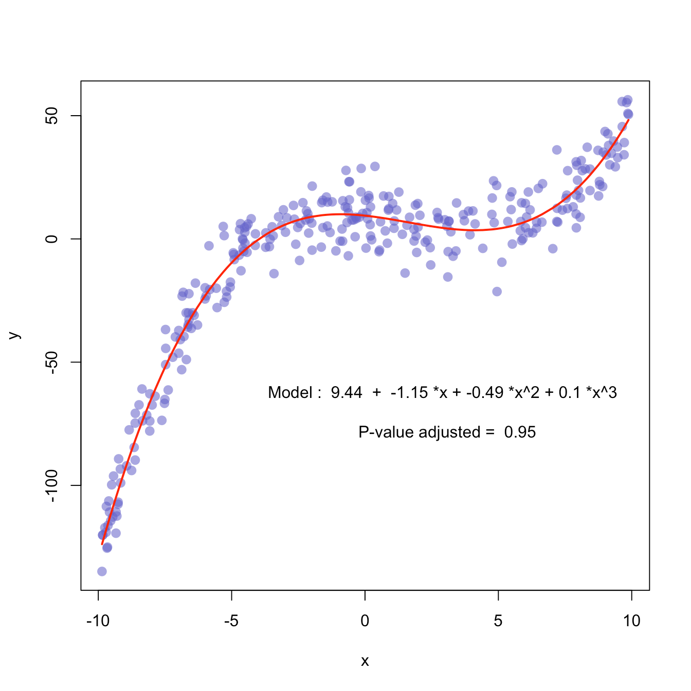
Scatterplots are useful to show the relationship between 2 variables (columns). A line graph is also used to show the relationship between 2 variables. However, where the 2 differ is on what the underlying message is.
In a Scatterplot the goal is to examine the relationship between 2 variables. For example, if you have a bunch of dots, the goal then becomes to try to see what the line/curve of best fit shows so you can try to understand the underlying relationship.
Think Scatterplots as tools for more of a research examination task.
Line graphs are great when you are handling data that is a time series, and has been resampled. If you recall, in grade 12, we learned the definition of a function in our high school class. To put it simply, if the data you have can be mapped as a function, then line graph is terrific for this. If it cannot, then scatterplot is your go to.
Summary:
if for 1 x-value, you can have multiple y values → Scatterplot
if, for 1 x-value, you can only have 1 y value → line graph


