Data Storytelling 7: Principles of Visual Perception
We'll talk about something called "The Gestalt principles of visual perception"
When you start off a report, you have a blank page. Now, every single time you add something to that page, it takes up brain power from your audience. And, remember the thing we talked about a few posts ago “Your audience doesn’t want to use their brain power”. This means if you are going to add in more and more elements to your report, they better add informative value to make up for it’s presence. Else, it’s best to leave it out.
1 - Excessive Cognitive Load
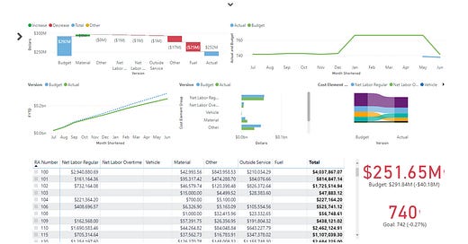
If you are reading this, you are a data professional, or someone who is about to be one. This means you’ve probably looked at several reports, or sat through several presentations. How many times have we all looked at a report, saw almost all of the whitespace get completely taken up by text, and graphs, and then we go “Wow!…. Next page”. If you’ve never had that experience, then look at the image below:
No one’s reading anything there because it takes too much brain power to try to make sense of simple stuff. This is an example of Excessive Cognitive Load, and this is something you want to avoid in your reports, and your presentations.
To avoid putting your audience in this scenario, you need to monitor the “Signal to Noise” Ratio for your elements in your report. If you add something to the report, how much of a value add is this, and how much brain power does it take to process it?
2 - Gestalt principles of visual perception
The Gestalt principles of visual perception are a set of theories developed by German psychologists in the early 20th century to explain how humans naturally organize visual elements into groups or unified wholes when perceiving objects.
These principles suggest that our brains are wired to see structure, logic, and patterns, allowing us to interpret complex images or designs as a whole rather than just a collection of parts. Here are some key Gestalt principles:
Proximity
Similarity
Enclosure
Connection
2.1 Proximity
Generally speaking, we think of objects that are close to each other as those that belong to the same group. The proximity principle can visually be seen below:
When you are designing a table, you can leave an empty row in order to leave some space in order to separate your content into multiple groups. Same idea for the columns as well.
2.2 Similarity
The basic premise is, objects which are of a similar color, size, shape, or design are perceived as those which are related, or belonging to the same group. You can see this visually below:
When you are designing a table, and you want your audience to think groups of rows/columns are related to each other, then you should give them a similar color scheme/design. This will help the brain automatically assume the rows/columns are related to each other (without much brain power being used!)
2.3 Enclosure
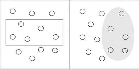
The basic premise is, objects which are physically enclosed together belong in the same group. You can visually see this below:
Without thinking your mind automatically groups everything in the rectangle into one group, and everything outside of it into another group. You can use this piece of information to improve your data storytelling skills by setting up an enclosure that separates the past historical actual values vs the predicted forecasted values. Example below:
2.4 Connection
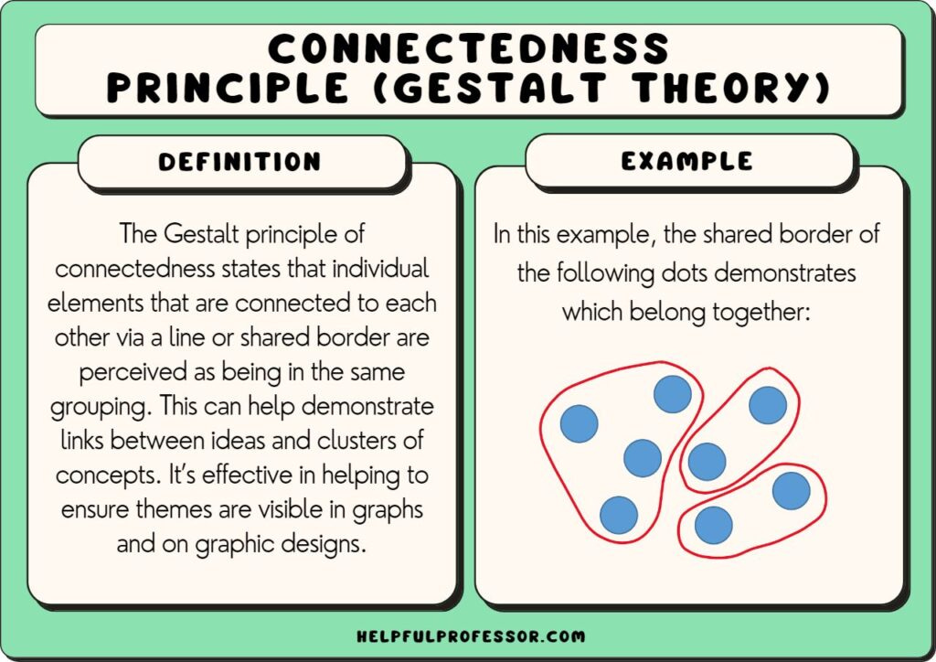
Generally speaking, we think of objects which are physically connected as port of a group. You can look at a visual example below:
The example above is for showing how connected lines can visually show different clusters (works even better if you follow the other 3 principles). But, when you are trying to build a scatter plot, you can actually use this principle. If you want to show your audience you have a bunch of data, and there really is no real pattern, then just give them a scatter plot.
But, if you want them to think that the data is connected, and is part of a much larger story, then switch the scatter plot to a line graph. Works great!


