


Data Storytelling 8: Step by step guide to fixing your graphs
Whole post is actionable advice you should use.

Alright, so, here’s a graph that people use all the time. Let’s go fix it.

1 - Yeet the border
Recall from the gestalt principles of closure that setting up borders, although makes the graph look pretty, does indeed require the audience to spend a bit of brain power. Ideally, you want to use the whitespace itself as a seperator, not the border here. So, go ahead and kick out the border.
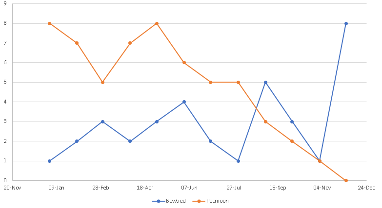
2 - Yeet the gridlines
Ideally in a line graph, the goal is for the audience is to visually see the up, and down trends, and they generally don’t know to know the exact precise values. So, kicking out the horizontal gridline is a great thing. However, every now and then, there are circumstances where your audience does want to know the precise values. In those cases, you can make the gridline extremely thing, and grey colored.
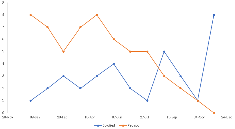
3 - Remove the data markers
See those dots on each of those lines? Those are
Keep reading with a 7-day free trial
Subscribe to Data Science & Machine Learning 101 to keep reading this post and get 7 days of free access to the full post archives.