


Power BI 6: Report Design
The What & the how, Effective Communication, Building Aesthetic Reports, Report Inspiration, Selecting *good* colors

Thanks to BowTied_Analyst for helping write this.
The last 3 posts have been fairly technical, so this one is going in a different, but equally important. I’m going to share tips and tricks for designing effective and aesthetic Power BI Reports. Welcome to Power BI Report Design.
This post will talk about your mentality and strategy and give actionable advice for developing a design. Then I’ll go through a design process on the data I’ve been writing about.
The What and the How
Before you create 5 different types of visuals, you need to figure out what you are trying to communicate and how. Write it down. Discuss with other stakeholders. Get everyone who might care on the same page about what the purpose of your Power BI report is and how to best communicate it.
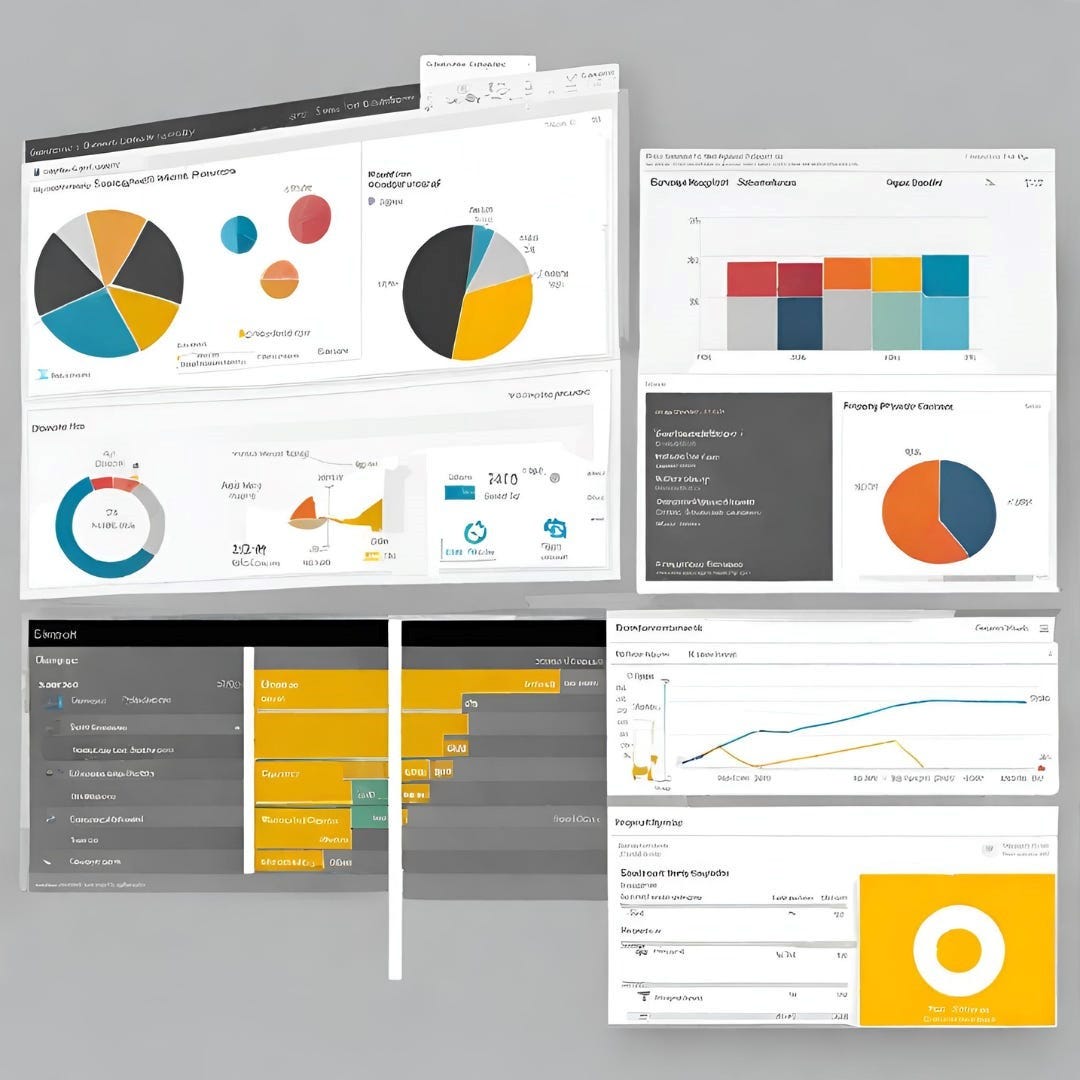
This sounds easy, but this is what I spend the most time doing. This is because there are effective ways and ineffective ways of communicating ideas. It is very easy, especially for those new to Power BI, to create busy, overcrowded reports. You might feel as of this is your first time being able to use a waterfall or a donut chart. You have to use them and the 15 other visuals you’ve never had a chance to use before.
Stop.
Do you want to show everyone how smart you are, being able to use all these visuals? Or do you want to build a report that is so effective in its communication that it takes less than a minute to pull the main points out?
My Strategy for Effective Communication
My strategy for effective communication in Power BI is simple:
1-4 high impact visuals
<8 cards with supporting information
<4 slicers to dynamically alter the report page
The only reason to design outside of these guidelines is if you have a report page that summarizes all other pages. If you cannot communicate your main point in under 4 visuals, your main point is too broad.
The purpose of your main visuals is to clearly and succinctly communicate whatever point you are trying to make. Sales over time. Changes in market share. How the launch of a new project is going. Someone should be able to look at them and it should be abundantly clear what the trend is. Simpler visuals are better. I know that waterfall charts are sexy, but bar graphs and line charts are >80% of the visuals I use on a daily basis.

I use cards to show information that reinforces whatever I am trying to communicate with my main visuals. Usually this means determining what specific metrics or statistics reinforce your point, creating DAX measures that will calculate these statistics and using these measures on cards. If you’re report is all about sales it might be total sales of your top-selling product or the delta percentage over a year or quarter.
Slicers are what make your report dynamic. Remember your data model? You
Keep reading with a 7-day free trial
Subscribe to Data Science & Machine Learning 101 to keep reading this post and get 7 days of free access to the full post archives.