Power BI 7: Final Post - Power BI Visuals
Standard Power BI Visuals, Miscellaneous Power BI Visuals, Python & R Visuals, Formatting Visuals
Thanks to BowTied_Analyst for helping write this one.
In the last post, I gave you a basic strategy for designing Power BI report. The report we designed had a single boring bar chart visual. Today we’re going to expand on that. This post is all about Power BI Visuals.
Power BI visuals are important. They are how you communicate the data to your audience. However, they’re no more important than your tabular data (connected to and cleaned with Power Query), data model, or DAX calculations. The creation of visuals goes VERY smoothly if you have taken the time to get your foundation built correctly.
This post will go through types of Power BI visuals and making design changes to visuals.
Types of Power BI Visuals
Power BI comes with over 25 types of visuals standard. If you cannot find what you want in Power BI, you can import visuals from Python or R. There are also hundreds of additional visuals available from third parties.
Standard Power BI Visuals
You can break down the standard Power BI visuals into several subgroups:
Standard bar/column/line charts
Percentage Visuals
Numeric Visuals
Maps
Specialty/Miscellaneous
I’m going to give you an overview of each type.
Bar/Column/Line/Scatter Charts
Power BI offers a wide variety of bar, column and line visuals. These are available individually but can also be combined.
Bar and column charts only differ by which axis your measurements occur on. They are useful for displaying differences in categorical data at a fixed time. These charts can be further broken down into stacked, clustered and “100%.” Stack the values categorical on top of each other but change colors based on optional categorical data (see below). Clustered cluster columns together and 100% are perfect for showing ratios based on a categorical.
Line Charts and Area Charts are useful for showing changes over time, like sales data. Combination charts combine multiple types. of line/bar/column visuals into one. Specifically you can create line and stacked column and line and clustered column charts.
These type of visual makes up the bulk of what I use when developing Power BI reports. They are great building blocks that are effective in their communication. They’re also kind of boring and often overlooked.
Percentage Visuals
There are two types of Power BI visuals useful for showing percentages, Donut Charts and Pie Charts. Both of these types of visuals show the relationship of parts to the whole. Donut charts are identical to pie charts except that the center is blank which leaves room for an icon/logo.
Numeric Visuals
Numeric visuals include cards, multi-row cards, tables and matrices. These types of visuals are good for showing individual metrics (cards) and large data dumps (tables and matrices). Numeric/data visuals are best used to reinforces the points communicated by other visuals that are displayed in your Power BI report.
Of the numeric visuals, Matrices allow for the most flexibility. Cards show a single dimension and tables show two dimensions. A matrix supports a multi-dimensional layout that allows highlighting of important data with functions as well as the ability to drill down on specific dimensions of the data.
Map Visuals
Power BI has several types of Map visuals which can be used to associate categorical and quantitative information with locations. Types of map visuals include:
Basic Maps
Filled Maps
Argis Maps
Azure Maps
Maps communicate the distribution of data in a geographical manner. In all the reports I’ve created, I’ve used a map <5 times. I used an azure map to show how categorical and quantitative information was organized spatially.
Miscellaneous Power BI Visuals
There’s a handful of other Power BI visuals that cannot really be categorized. These include:
Ribbon Chart
Waterfall Charts
Funnel Charts
Tree Maps
Gauges
Decomposition Tree
Ribbon Chart
Ribbon charts are good for showing changes in data across over time organized by specific categories. Think about sales of specific products or product families of time. The the values will always be displayed in descending order.
This ribbon chart tracks touches by running backs across time for the 2022 NFL season.
Waterfall Chart
A waterfall chart displays how a final value is reached via showing changes to a running total over time. Think about your personal finance. Every month you make a certain amount and spend a certain amount. At the end of the month you (hopefully) have more money/investments. A Waterfall chart would display individual transactions in green (you got paid) and red (you spent money) to arrive at the final difference in this months vs. last months net worth.
Funnel Charts
A funnel chart is useful for visualizing a process that has stages, like a sales funnel. You spend A on ads which turns into C clicks and D sales. A funnel chart can break down the numbers of each stage and allow you to decide how to better allocate advertisement capital.
Tree Map
A treemap is a method of displaying hierarchical data using sets of nested rectangles. Each category at the top of the hierarchy is a different color of rectangle and each color of rectangle is further broken down into different categories. Data is organized by size with the largest categories of each hierarchy in the top left and the smallest in the bottom right. Tree maps are useful for showing how parts fit into a whole and giving insight into patterns of data like outliers and important contributors.
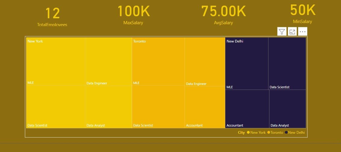
This tree map breaks down salary by location and job. You can one or many individual rectangles to filter your data as well.
Gauges
A gauge chart is a circular arc that measures progress towards a goal.
Decomposition Tree
A decomposition tree allows you to visualize data across multiple dimensions. Data is aggregated and the user can drill into the data in any order.
I created a decomposition tree in the HR Power BI report that we’ve been working on. The decomp tree analyzes total salary and visualizes the data across the geographical and department hierarchies. This specific tree breaks down salary of employees located in Toronto, that are part of the data department, tech working group by their individual jobs.
You would set up a visual like this by analyzed the sum of salary and explaining by each of the categorical.
Python and R Visuals
Any visuals you can create using Python or R can be imported into Power BI. This opens a wide range of additional visuals including boxplots, histograms, heatmaps, violin plots and many more.
Python/R script visuals require you to reference where Python/R are located on your computer and write code creating and displaying the visuals in your report. This isn’t something I’m going to get in right now, the important takeaway is that you are not limited by visuals that are present in Power BI or available through 3rd parties.
3rd Party Visuals
Not finding what you need in the standard Power BI plots and not comfortable with building out a visual in R/Python, you can always check visuals available from 3rd parties. Some of these visuals are free, some are freemium and some are paid. There are hundreds off additional 3rd party visuals available in Power BI.
To explore 3rd party visuals, open up the visuals pane and click on the 3 dots in the lower right hand corner, this will launch the Power BI 3rd party visual marketplace.
A lot of the third party visuals are normal visual with a small piece of additional functionality.
Formatting Power BI Visuals
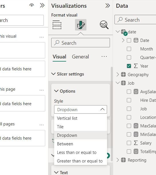
The style, coloring and function of Power BI visuals can be adjusted in the Visualization tab if a visual is selected.
There are tabs for general visual formatting and formatting options specific to your type of visual. The visual I selected for formatting is a slicer, a slicer has different options for how it is displayed.
Now that you’re oriented with how to explore visuals, I encourage you to do so in your own reports.
Conclusion
This is the end of my 8 post introductory series on Power BI. We started by getting Power BI software on your computer, we added data and cleaned the data using Power Query. We built a data model so as to make creating visuals easier and allowing for dynamic filtering. The final report we created is simple but functional and while the color theme has a little too much mustard in it, it is congruent. Finally, we explored additional visuals that you can use to improve communication.
Hopefully you learned something from reading this series, it has increased your learning speed and sped up the development of your first Power BI Report. Let this be a useful blueprint for learning Power BI and a jumping off point for your career as a Data Analyst.
-BowTiedAnalyst


