


PowerBI Crash Course & Series Overview
Here's a brief overview of what you can expect with the upcoming PowerBI series.

Thanks to BowTiedAnalyst for helping out with this series.

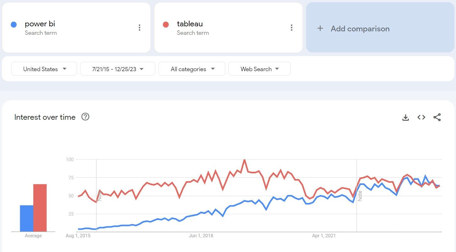
Power BI is a software package that is Microsoft’s answer to the business analytics market. You can think of it as a combination of Excel and PowerPoint. Power BI was not the first business analytics software. Its market share has been steadily rising (at the expense of Tableau) since its release in July 2015. This is because it is integrated with the full suite of Microsoft products.
Power BI seamlessly integrates with Excel, SharePoint, Azure, Microsoft SQL Server, and hundreds of other data sources. It is also a key element of Microsoft’s new analytics initiative Microsoft Fabric.
Who Uses PowerBI?
As a data analyst, a large percentage of my day consists of building and maintaining Analytics Dashboards in Power BI. While I do a certain amount of web scraping and pipeline building, the majority of my time is spent refreshing Power BI dashboards and more importantly troubleshooting them when something goes wrong. I need to understand how data comes into Power BI, what changes Power BI makes to properly display data coming in, how the data flows into various visuals and how the visuals are used to make decisions.
What can PowerBI do for you?
Power BI is a relatively intuitive way of communicating important and self-updating information to a bunch of people. When I say intuitive, I mean for the end user. A properly designed Power BI report will give an end user everything they need to explore and understand data and pull actionable conclusions from it.
For someone building reports, there is a learning curve. Unlike excel, you can’t plug data in and do some calculations on it. Extra work needs to be done to take full advantage of Power BI’s ability to slice data and automatically update visuals and numbers based on and end users’ exploration. And it’s this aspect of Power BI that is driving its growth.
I am starting to see a big push from execs who are sick of receiving 10 versions of the same PowerPoint or Excel document (with minor changes) in the leadup to quarter-end. And I am seeing a lot of people who are sick of making 40 backup slides to a 6 slide PowerPoint. Power BI solves these problems.
I do not work for a Tech company (we are a little behind the curve technology-wise). Since I've been in my position, my company has reached a tipping point with its use of Power BI. When it comes to communicating data, Power Point is out, and Power BI is in. Excel is out and Power BI is in. Even if you have no intention of working in the field of Data, Power BI is a great skill to have. It may soon replace much of the legacy corporate methods of presentation and communication.
What you can expect from this series?
This series of articles is going to be your basic Power BI crash course. I’m going to seriously cut down the learning curve for you, but you need to realize that the learning curve is still there. You will learn enough that you won’t spend hours in front of a computer screen wondering why your visual isn’t populating correctly, but Power BI a complex package and will take time and effort to learn.
This series will cover the following:
Downloading the Software and Tips for Learning
Adding Data into Power BI (specifically .XLSX, SQL and SharePoint)
Using Power Query for data Manipulation
Data Modeling
Basic DAX
Power BI Visuals
Effective Report Design
This series will give you the basics to get started creating your own dashboards. It is in through the application of what you learn through reading that drives understanding and eventual mastery.