Data Storytelling 9: Funneling their attention
Memory, Pre-attentive attributes, Actionable information
On the last data storytelling post, we talked about how to clean up the clutter from your visuals. This time, we’ll talk about something called “pre-attentive attributes” and how you can use it to funnel your audience’s attention onto something. Before we dive into these attributes, let’s have a quick recap on how memory works
1 - Memory
Humans have 3 forms of memory: Iconic, Short term, and Long Term.
1.1 Iconic Memory
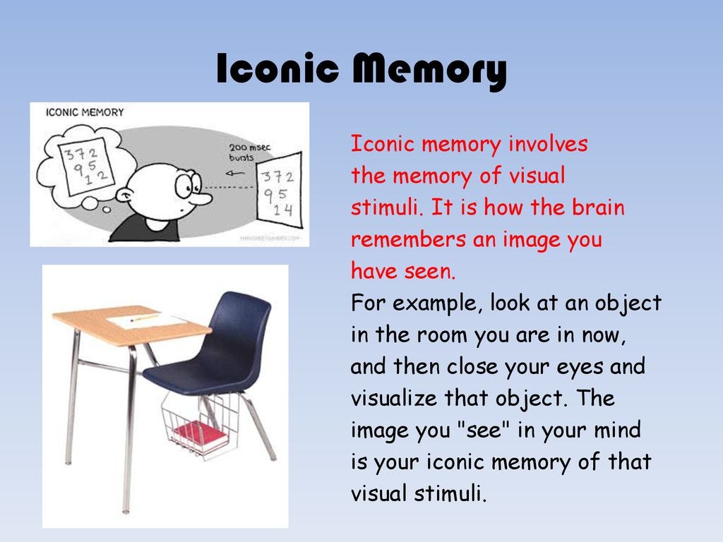
Iconic memory is extremely fast. It is so fast, that it actually happens without you even consciously realizing it, and you trigger this type of memory every time you look at the world around you, and find “different/unusual” things. In the past, our ancestors had to be really good at spotting predators (iconic), back then this type of memory helped them survive.
Today, information stays in your iconic memory for a fraction of a second, before it goes to your short term memory. The important thing about this kind of memory is that it looks for certain pre-attentive attributes, and we will want our visuals to incorporate them, so it increases the likelihood of our audience retaining information.
1.2 Short-term memory
People can keep about four chunks of visual information in their short term memory at a given time. This means if your graph has more than 4 different data series in there, then unfortunately you will basically be forcing your audience to go back and forth between the graph & the legend.
Remember what we talked about a while back, the more your audience has to work to read your graph, the less likely they will be, to actually read it. And, now you know that the max limit of most humans is 4 different pieces of visual information.
You can, of course use the Gestalt principles to group up certain data series, but we’ll worry about that at a later time.
1.3 Long Term Memory
When something has served it’s purpose in the short term memory, it will either be completely forgotten about, or it will make it’s way to the long term memory. The long term memory, as you can guess from it’s name is basically the memory that is built up over a life time, and is vital for long term pattern recognition, and for cognitive processing.
It’s also the thing that stops you from looking like a chump, such as from the video below:
2 - Pre-attentive attributes
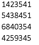
Let’s do a fun little experiment, you have 5 seconds, count the number of 4s you see in the pic below:
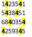
Great, now let’s try this again, with some good pre-attentive attributes being used:
Much easier right? Congrats, you just saw the power of pre-attentive attributes with your own two eyes.
2.1 Types of pre-attentive attributes
Pre-attentive attributes go and focus straight on our iconic memory, in other words, before someone even consciously realizes what they are looking at, our attributes grab their attention, and focus it on what we want them to look at. And, by constantly being in control of our audience’s attention, and choosing where it goes, we can effectively funnel our audience’s attention to where we want, and make them ignore what we don’t want them to see.
Here are some pre-attentive attributes relevant to all data professionals:
Most of these are pretty common sense, so we don’t need to go over each of them visually, instead we’ll just focus on examples on where a data professional would use some of them to make their graphs better.
3 - Using Pre-attentive attributes
3.1 Your Resume
Recall from one of my earliest resume writing post, I told you guys to align the keywords to the left, and make them bold.
Congrats, now you know the real reason why. It’s designed to capture the HR lady, and the Hiring Manager’s attention, and have them look at the bolded keywords, and to make them think you speak their language. AKA, have them start looking at your resume immediately in a positive light.
3.2 Grabbing Attention on a graph
The color black is a strong contrast color to most other colors. For those of you who read BowTiedBull’s “Colors for men” book, you know they recommend high contrast colors (ie pure white/black) in many outfits. High contrast is an attention grabber, and on outfits, it looks great.
Let’s take a look at this original graph over here:
Now, let’s say we wanted to have the viewer look at category B, but we were only going to do a minimalistic design, that is we will follow the gestalt principles and kick out everything to have a minimalistic design.
Notice how in this minimalistic design, without knowing, your attention will automatically go to B, even though it’s actually C which is the highest value.
3.3 Fixing a comparison line graph
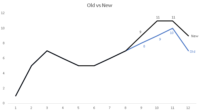
A common thing you’ll be asked to do is a comparison test, ie some old methodology vs a new one. And, if it’s a time series, you’ll be doing this in a line graph. So, let’s start with a common graph that most people will usually make, and then let’s make it better.
Here’s the original graph that most will make:
Let’s use the Gestalt principles, and have a minimal layout as our new starting point.
We will now use contrast to separate the two data series. From a visual perspective, because the separation happens on the right side, the viewer’s eye is immediately going to the right, and ignoring the left.
We now add in a minor bit of labelling to where our audience’s eyes are already grabbed, and voila.
At this point, you are probably asking yourself aren’t these techniques the same ones that internet marketers use?
Yes! We’ll talk about that more in the next post.


